
Smartphones
Why it matters: More visitors browse on their phone than their computer, often on the move and short on time.
What we do: Single-column layouts, readable text and contact details that are one tap away.
In today’s mobile-first world, your website must perform flawlessly across all devices. Here’s how we make sure it does, on every screen, every time.
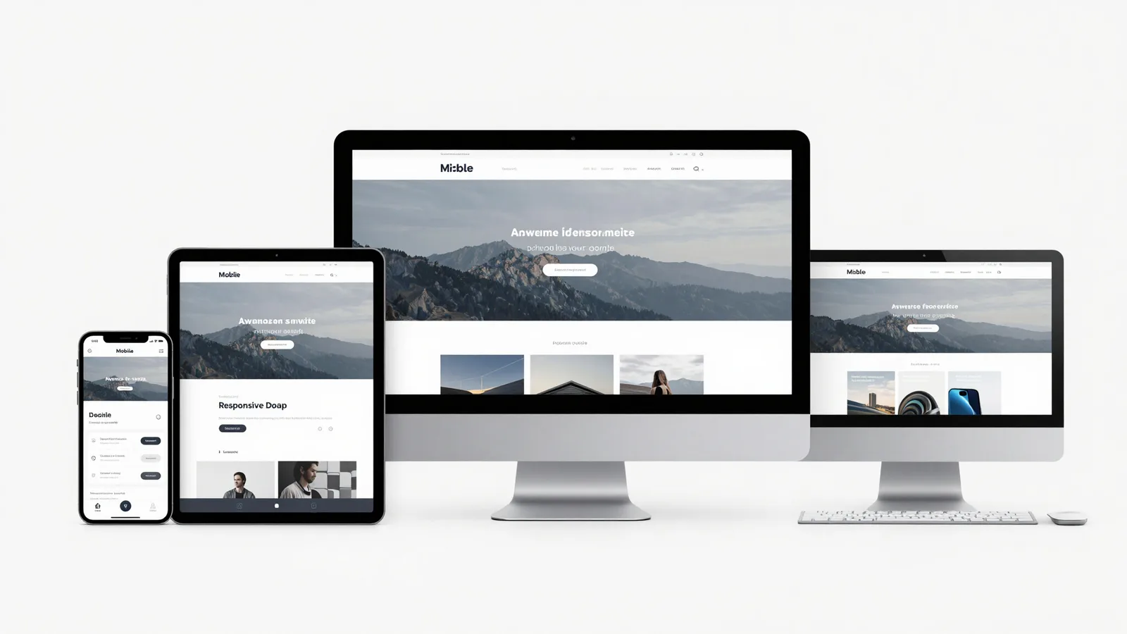
We build responsive layouts that automatically adapt to desktops, tablets and smartphones. This commitment to accessibility means you never miss an opportunity to connect with your customers, no matter how they choose to browse.
We combine stylish visuals with airtight code to deliver a seamless experience every time.
Your customers switch between screens. Your website should keep up.
Why it matters: More visitors browse on their phone than their computer, often on the move and short on time.
What we do: Single-column layouts, readable text and contact details that are one tap away.
Why it matters: Tablets sit between phone and desktop, and fixed layouts often break awkwardly in the middle.
What we do: Layouts that rearrange sensibly at in-between sizes, so nothing looks squashed or stretched.
Why it matters: Bigger screens are where many customers compare options and make decisions.
What we do: Spacious layouts that use the extra room well, without lines of text becoming too long to read.
Responsive design isn’t an add-on we bolt on at the end. Mobile-responsive coding is part of Phase 2 of every build, so each page is designed and tested to work on phones, tablets and desktops before it goes live.
After launch, our monthly health check views your site exactly as a mobile visitor would, so problems are caught early.
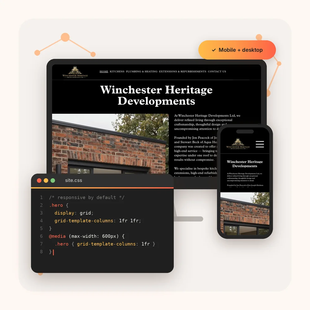
The techniques that make a layout adapt without compromise.
Why it matters: Designing for the smallest screen first keeps pages focused on what matters most.
What we do: We start with the phone layout, then add space and columns as the screen gets bigger.
Why it matters: Images that don’t resize can overflow the screen or slow the page down on mobile data.
What we do: Images that scale to fit any screen and load efficiently, so pages stay quick and tidy.
Why it matters: Tiny links and hover-only menus are frustrating, or impossible, to use with a thumb.
What we do: A clear mobile menu and buttons large enough to tap comfortably, with nothing hidden behind a hover.
Stylish visuals backed by code that works for everyone.
Why it matters: If text is too small or too faint, some visitors simply can’t use your site.
What we do: Comfortable text sizes, strong colour contrast and clear headings on every screen size.
Why it matters: Messy code causes layouts to break in unexpected ways and slows pages down.
What we do: Clean, well-structured code that keeps your site fast, stable and easy to update.
Why it matters: A layout that works on one screen can still break on another.
What we do: Live QA and testing across phone, tablet and desktop sizes before your site goes live.
Every one of these adapts to phones, tablets and desktops. Try them on your phone.
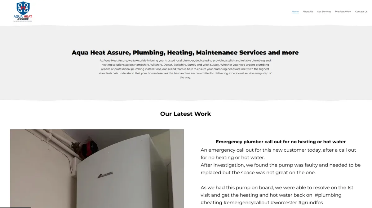
Professional plumbing service based in Hampshire.
View Live Site
Elegantly structured site for heritage building services including custom kitchens and plumbing.
View Live Site
Vibrant, modern website for an English pool and sports bar.
View Live SiteEach page is planned for phone, tablet and desktop from the prototype stage.
Mobile-responsive coding goes into every build and is tested on real screen sizes.
Our monthly health check makes sure your site keeps working properly on mobile.
Free Phase 1 prototype. Packages from £500. No obligation.